
My Banks' Websites Suck

The following is an amalgamation based on my reluctant observation of several banks' websites.
1) The bank website is slow. When it loads it takes so long that parts of it time out… waiting for other parts. When I perform an action I am always left to wonder if it took effect. What feels like minutes later, I see that it did. I have learned to take my hand off the mouse, sit back and wait. If I can sing the Jeopardy! song four times before it settles down, there might be a problem. And of course, controls on the screen move a hundred pixels or so, a fraction of a second after I click them. This results in my having clicked something else.
2) The bank website is buggy. When I sign off, it goes back to a login screen. It's a trap! This login screen will not work. If you log in on this screen, you'll get inscrutable error messages that quickly disappear, and then a new login screen. The second login screen works, but leaves behind a nagging suspicion that the first login screen has stolen your credentials.
The secret turns out to be, to click on the bank's logo on the top left, and get a fresh login screen. That one will behave properly.
3) The bank website is arbitrary. Here's a richly detailed example: Six months or so after changing the email address I use to have Chase Bank communicate with me, I started getting this after logging in:
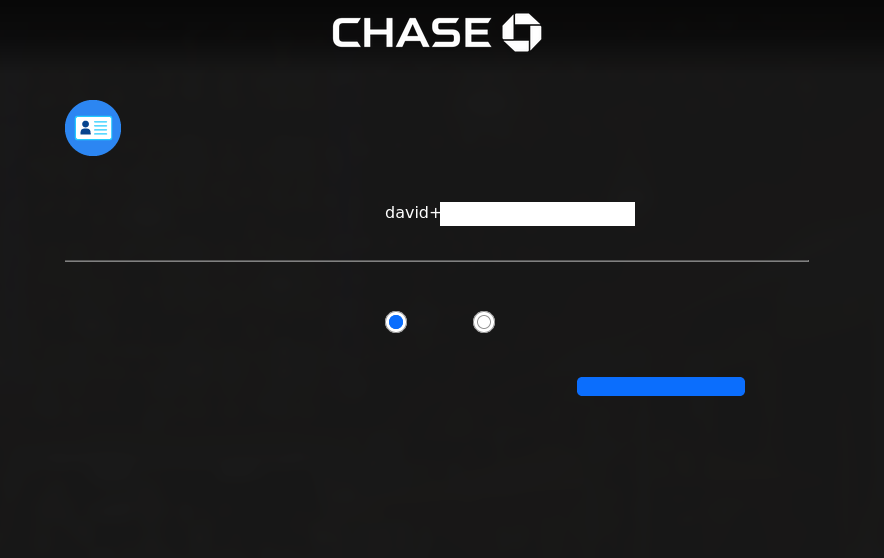
The redacted text is my email address. On this screen, it is selectable text but cannot be edited. The two radio buttons and the blue bar show as clickable when I mouse-over, but I am afraid to click them. Nothing else on this screen is clickable. Not that there's much else on this screen.
The URL of this screen ends with:
intercept?name=BAD_EMAIL_ADDRESS#/intercept/addOrUpdateEmailAddress/updateIf I modify the URL by removing all that crap, the website obediently reverts to its normal behavior by showing me my accounts dashboard. Solid.
This all started two weeks ago, and it seems pretty plain that Chase is having opinions about my email address. Note that this is an email address I changed to back in September of last year. I have dozens of emails from Chase using this email address.
The email address has a + sign in it to allow a Chase-unique suffix, so I can be aware if they sell my email address to spammers. I suspect, though nobody at Chase will confirm, this is why they are having a fit of pique. They don't want me to know that they were the ones who sold my email. Unlike many people, I have another recourse from this: since I have my own domain, I can create as many unique email addresses as I want. Perhaps they will find "ChaseBankSucks@mydomain.tld" less of an issue?
Since composing the above, two interesting things have happened. One, following a looooonnng call I had with their web support line this morning, Chase sent me an email telling me that I had changed my email address. I had not. But Occam's Razor tells me, they did. The thing is, it's still the same email I have had all this time. So they changed it to... itself? And the second interesting thing is, the last time I logged in, the black intercept screen has not reappeared. If they actually fixed something, they have decided not to communicate that fact.
4) The bank website treats me like an idiot. Because they think I haven't the capacity to examine more than a single item of information at once, when I want to make a payment, I must click thru five screens.
The first: Verify that the payment account I am using is the same one I have been using for six years. Next Screen!
The second: Choose an amount to pay. Next Screen!
The third: Choose the date to make the payment. Next Screen!
The fourth: Now I must review all the stuff I chose on the first three screens and then, finally, actually make the payment. Next Screen! (oh, did you think we were done? You funny!)
The fifth: Review it all again, after I have committed to it on the fourth screen. Can we escape next-screen hell now? Oh, we can? kthxbai!
5) The bank website won't use proper two-factor authentication.
Authy and YubiKey, why do I have these? Apparently to protect my Twitter account. Because when it comes to banks, they are just not in the conversation. But sometimes in banking, news of the world can leak in a little. It's kind of muffled and distorted but they get scraps and go with them.
So banks got the idea they should have two-factor authentication. Then they misheard the part where we were saying (out here in reality) that email and SMS were so shitty for this purpose but hey, maybe better than nothing. All they heard was "...email... ...SMS..." Accordingly, I have a bank that can only email my auth code. I have one that can only text-message.
I have one that can do both, and does so every single time I log in. The "Remember this device" checkbox is a placebo, because the next time I log in from the same device, it's the same thing again. Hey: it used to do this multiple times per session - at least they've fixed that for now.
One still asks "security questions." Yeah, you forgot there were even worse things than 2FA via SMS.
Then there's the one that can only text but if I want to sign in "with the mobile app" that's somehow cool.
I don't know why the bank website has to be so crap. I would hope it's programmed to be extremely resistant to hacks, but I did not think that required a bottom-of-the-barrel UX.